8 Apr 2022
Puratos’s newly launched identity represents the company's purpose ‘to move the planet forward by creating innovative food solutions for the health & well-being of people everywhere’. Wondering what is the meaning behind each element?
A new logo, and of course a unicorn
The Puratos logo is an expression of what the company stands for and the value it brings to customers, employees and partners. The company has maintained the unicorn as its corporate symbol, revamped it and positioned it differently near the brand name. The unicorn faces forwards to the future, and is placed at the beginning of the brand name to show that Puratos is an inclusive company for its customers, partners and people.
Sophie Blum, Puratos CMO, highlights:
“Our symbol is the unicorn, representing positive behavior and courage. The unicorn has captivated human imagination around the globe for over 2,000 years as a symbol of purity, protection and integrity, and it remains a ubiquitous icon. It is part of Puratos’s unique brand experience. Today, the unicorn also symbolizes successful startups, just like Puratos once was, when the company began as a small father-and-son operation and grew into a successful international business."
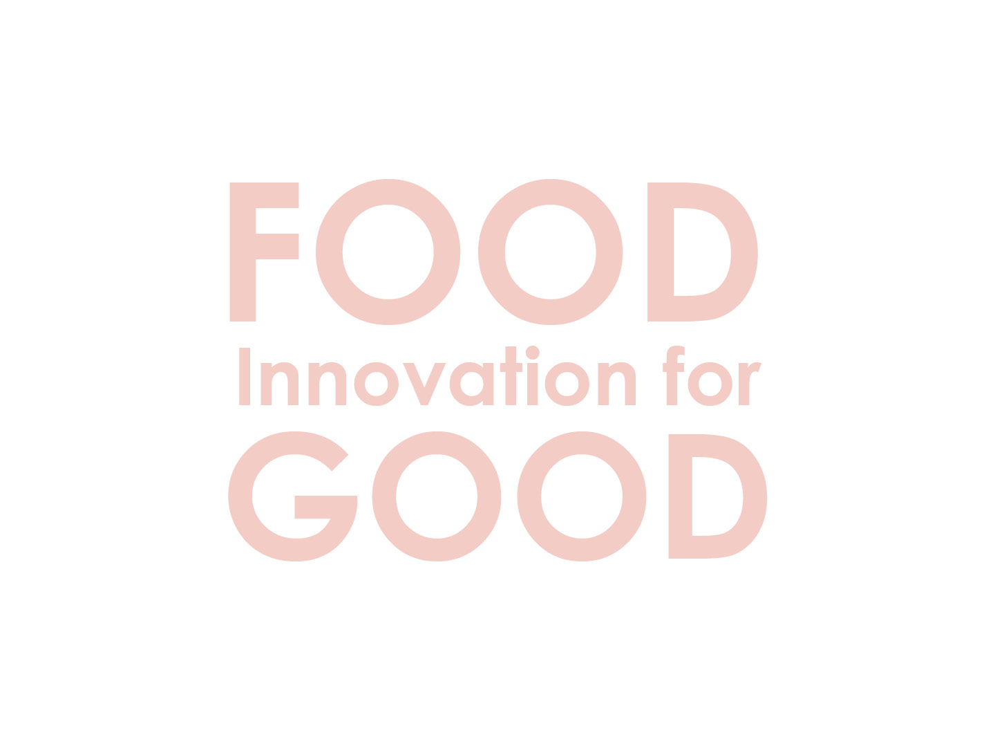
A new tagline
‘Food Innovation for Good’ represents the company’s ambition to increase the positive global impact it makes through the creation of innovative food solutions that promote health and well-being and to steadily move businesses, customers, people and the planet forward.
New colors, typography and a graphic circle narrative
Puratos red is the main color in the company’s visual language. As a color, red represents vigor, passion and life force itself. It is set to represent Puratos’s commitment, determination and passion for food so as to help customers grow their business through innovation while also creating a positive impact.
Commenting on the new branding and visual identity, Sophie Blum says: “The key graphic device in our new identity is the circle. It is timeless and universal. The circle is associated with the earth and represents a motion that keeps things moving forward, transitioning, in endless movement, just like our own ambition to move the planet forward. The circle represents our collaborative team spirit and cooperation with customers and partners. There is no place where one line ends and another one begins.”